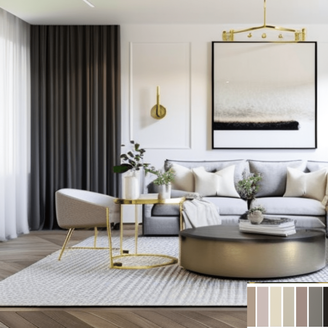
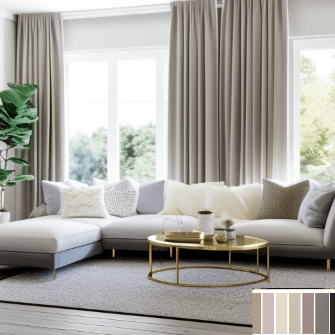
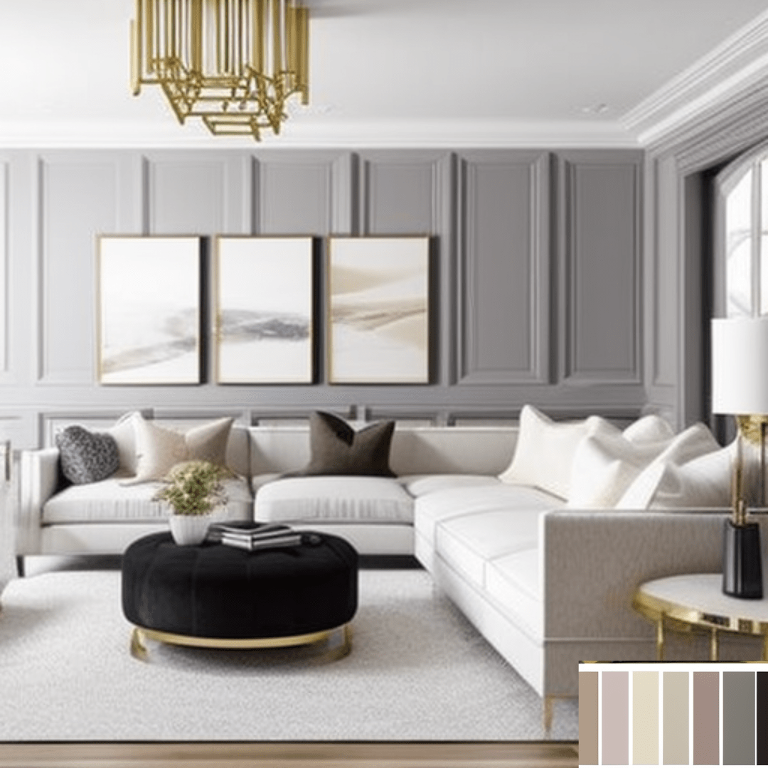
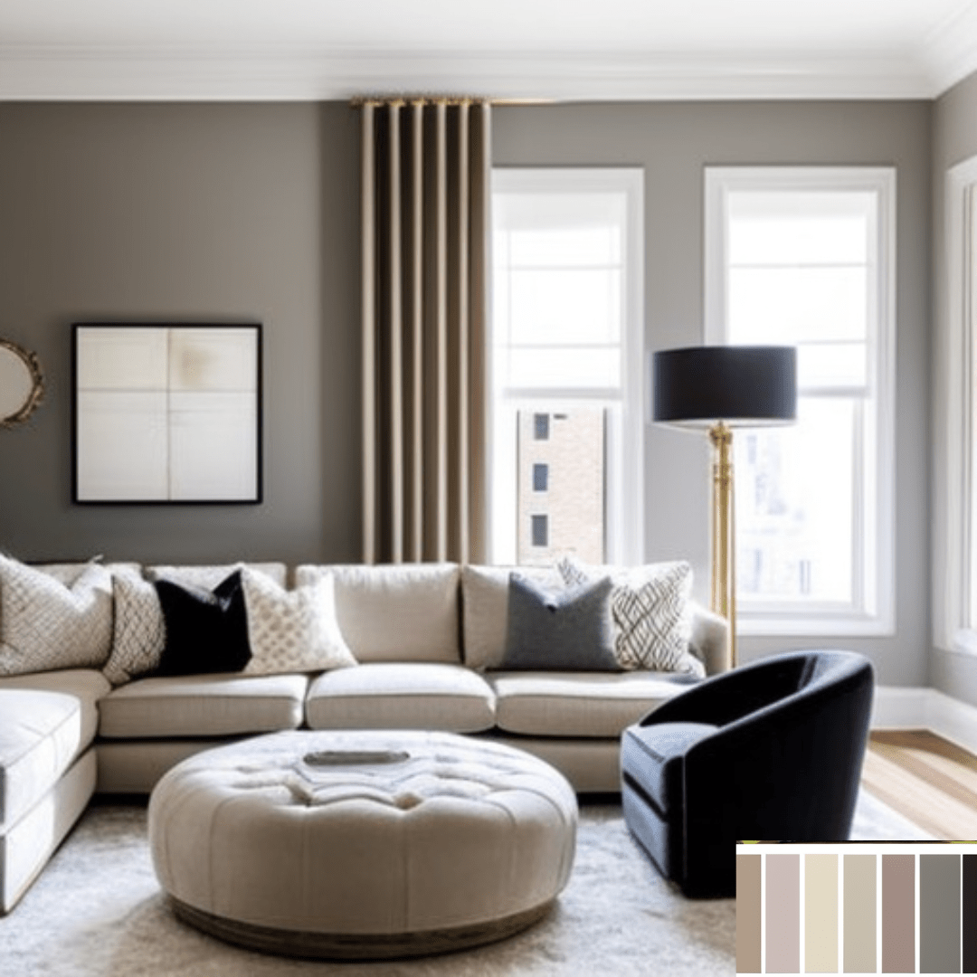
Neutral tones are hues that lack a prominent chromatic component, such as beige, ivory, grey, and white. These hues are frequently utilised as a backdrop for other, more prominent hues. Neutral tones can be matched with virtually any accent hue, making them a versatile interior design choice.
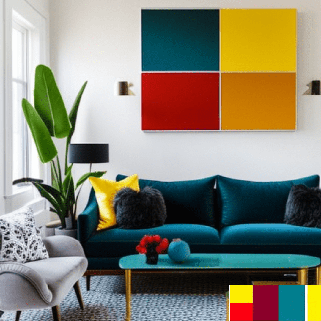
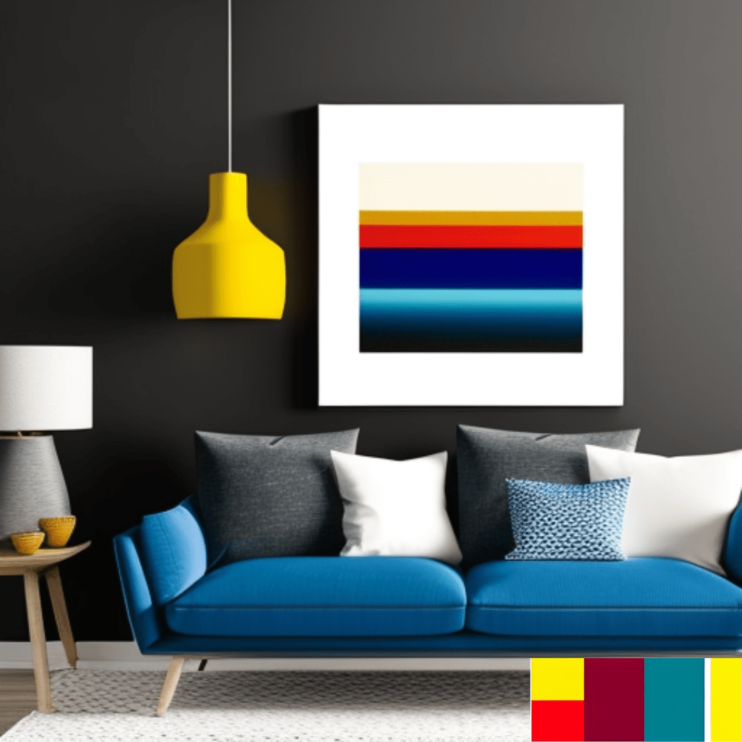
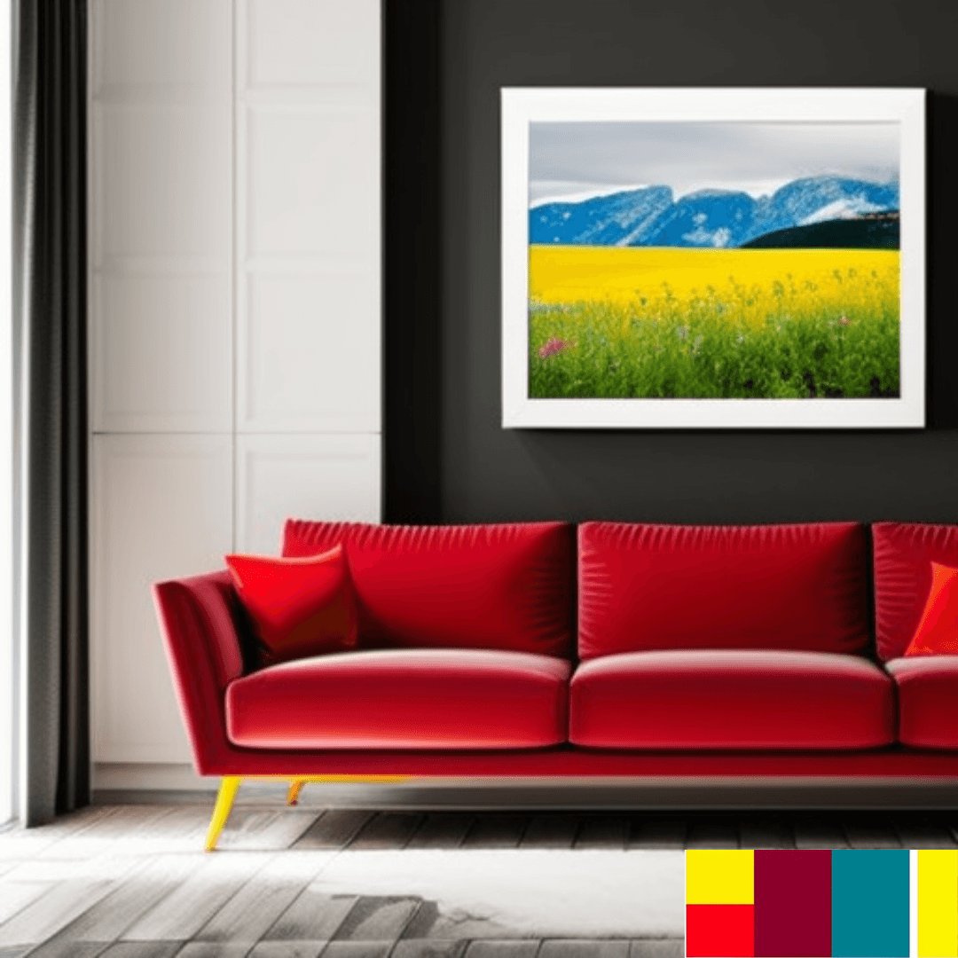
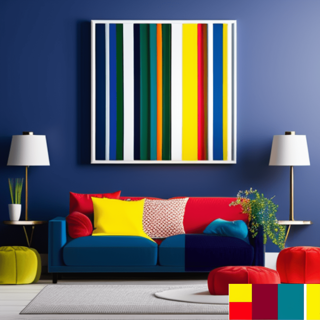
Bold & Bright colors
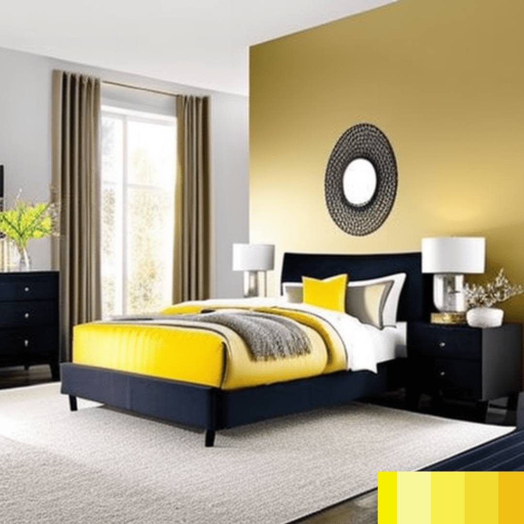
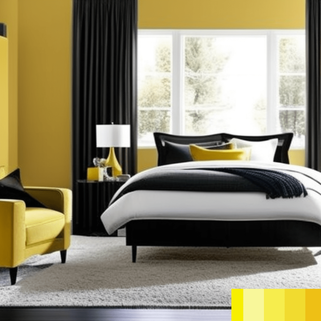
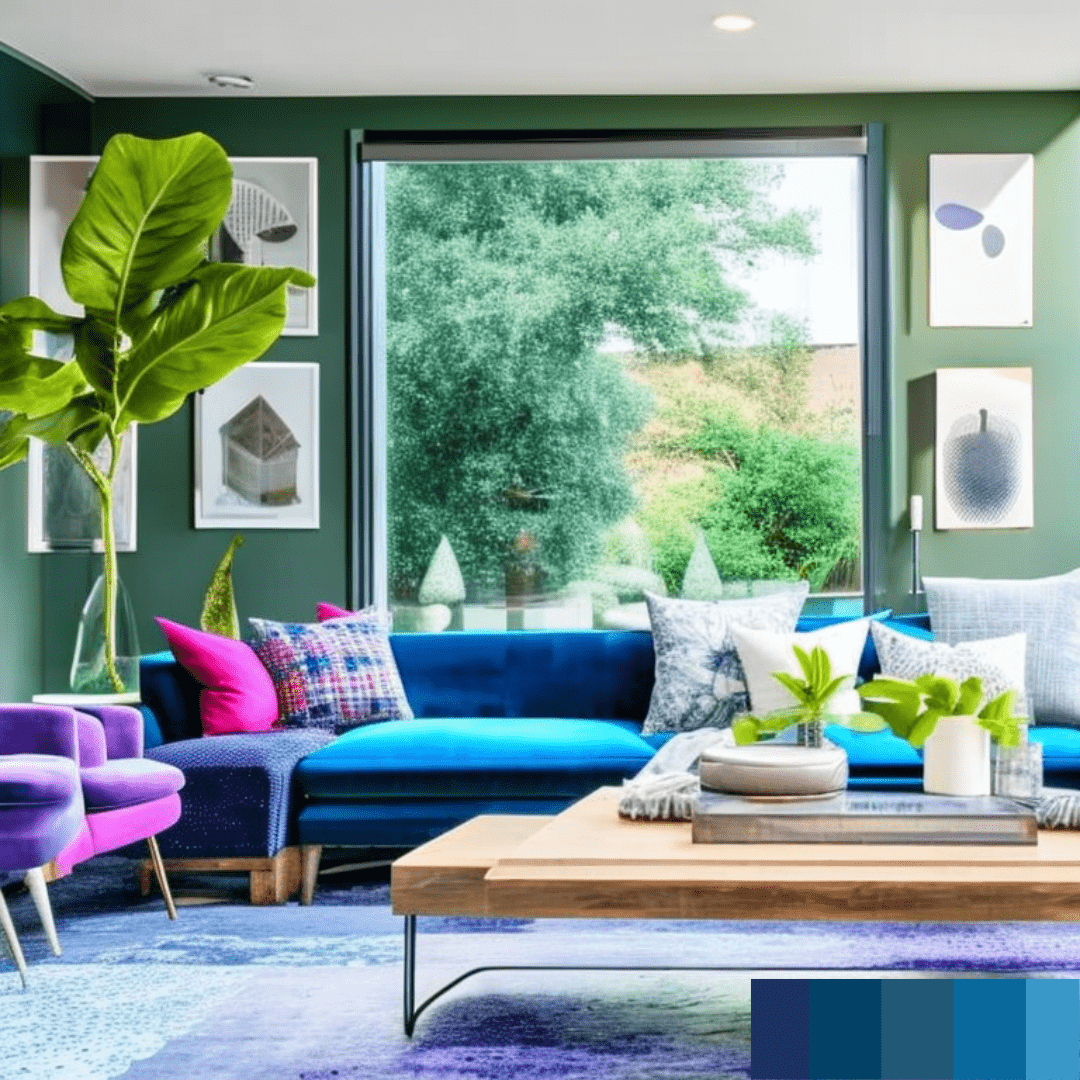
Red, yellow, blue, and green are examples of bold and bright hues that are vivid and arresting. These hues are employed to inject enthusiasm and vitality into an area. In a space with a neutral colour scheme, strong and bright colours can be utilised as an accent or paired with other bold colours to create a dynamic and energising ambiance.
Monochromatic schemes
Monochromatic colour schemes use many tints and hues of a single colour to produce a unified appearance. A monochromatic colour scheme in blue, for instance, could consist of light blue, navy blue, and dark blue. Monochromatic colour schemes generate a sense of cohesion and simplicity, making them a popular option in contemporary interior design.
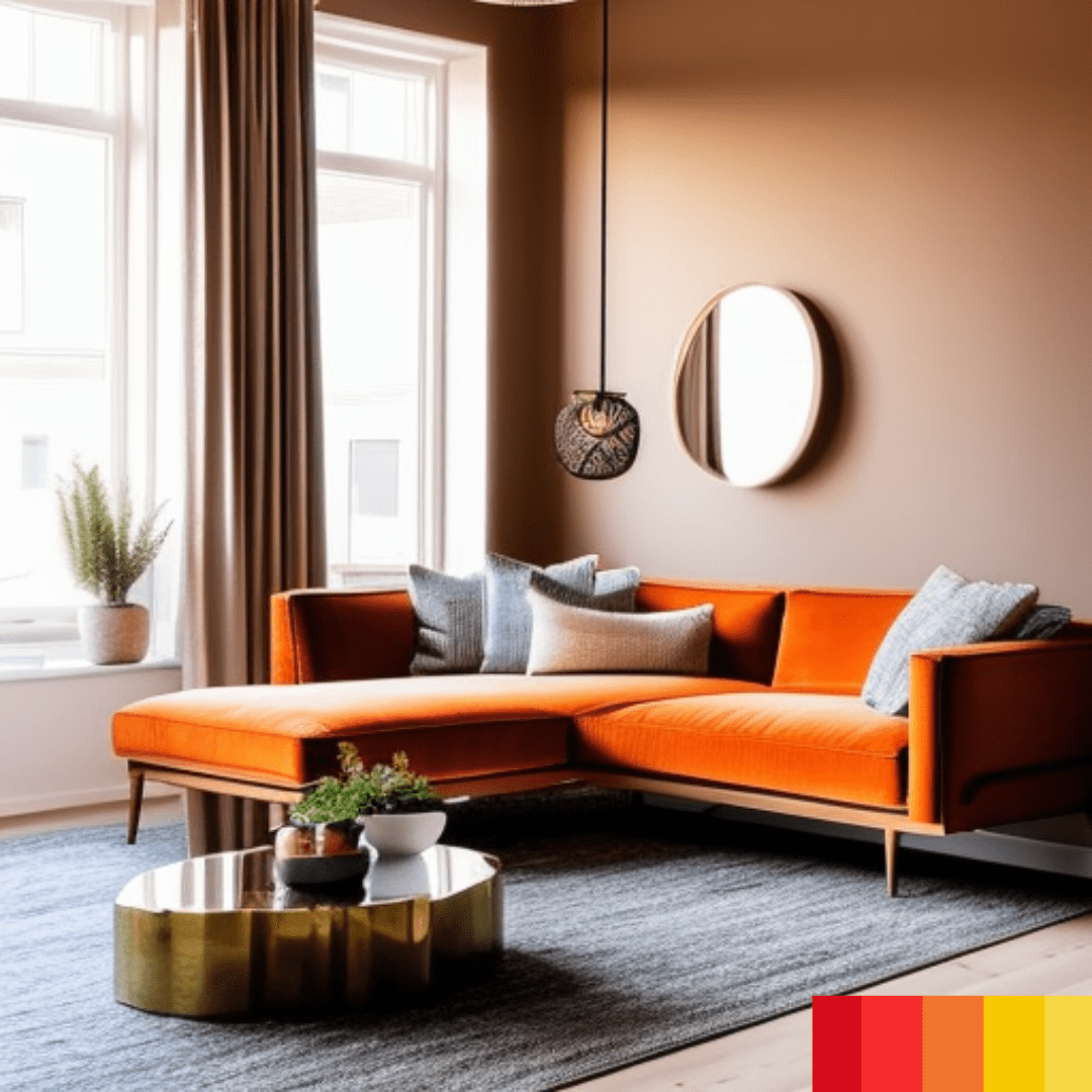
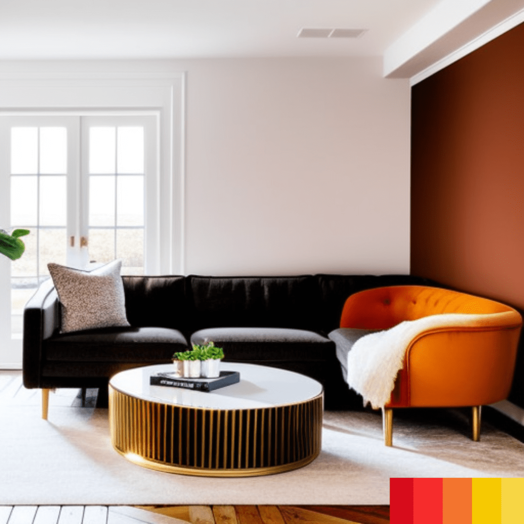
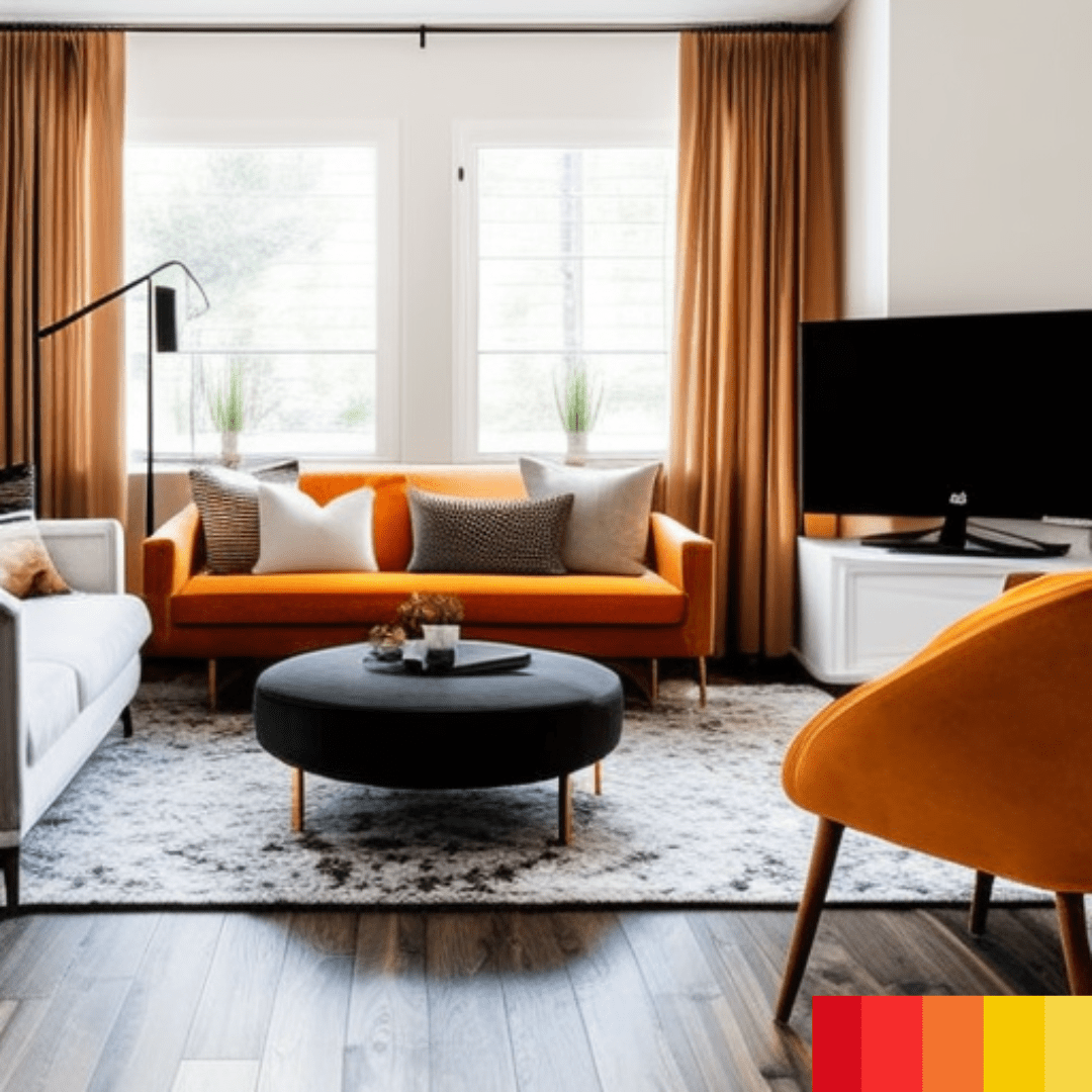
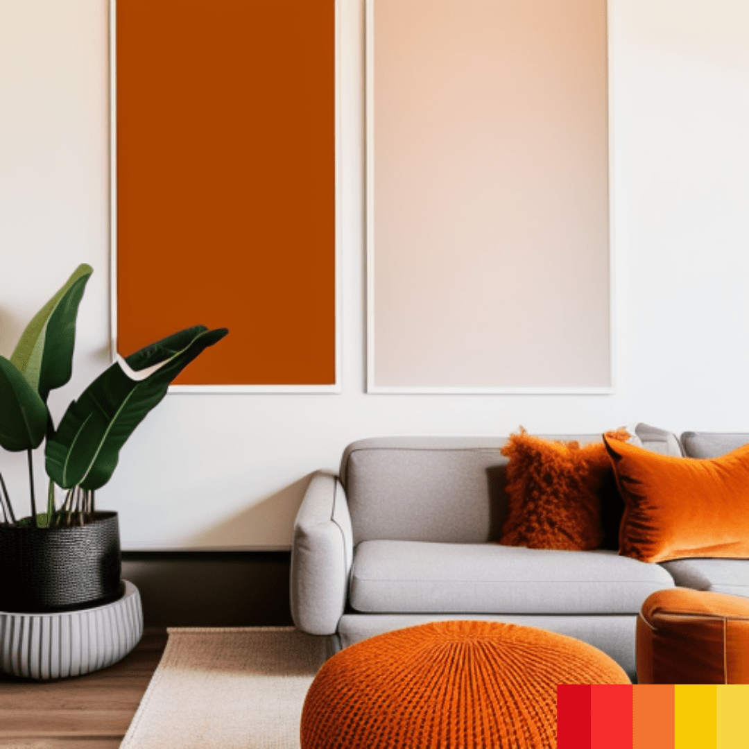
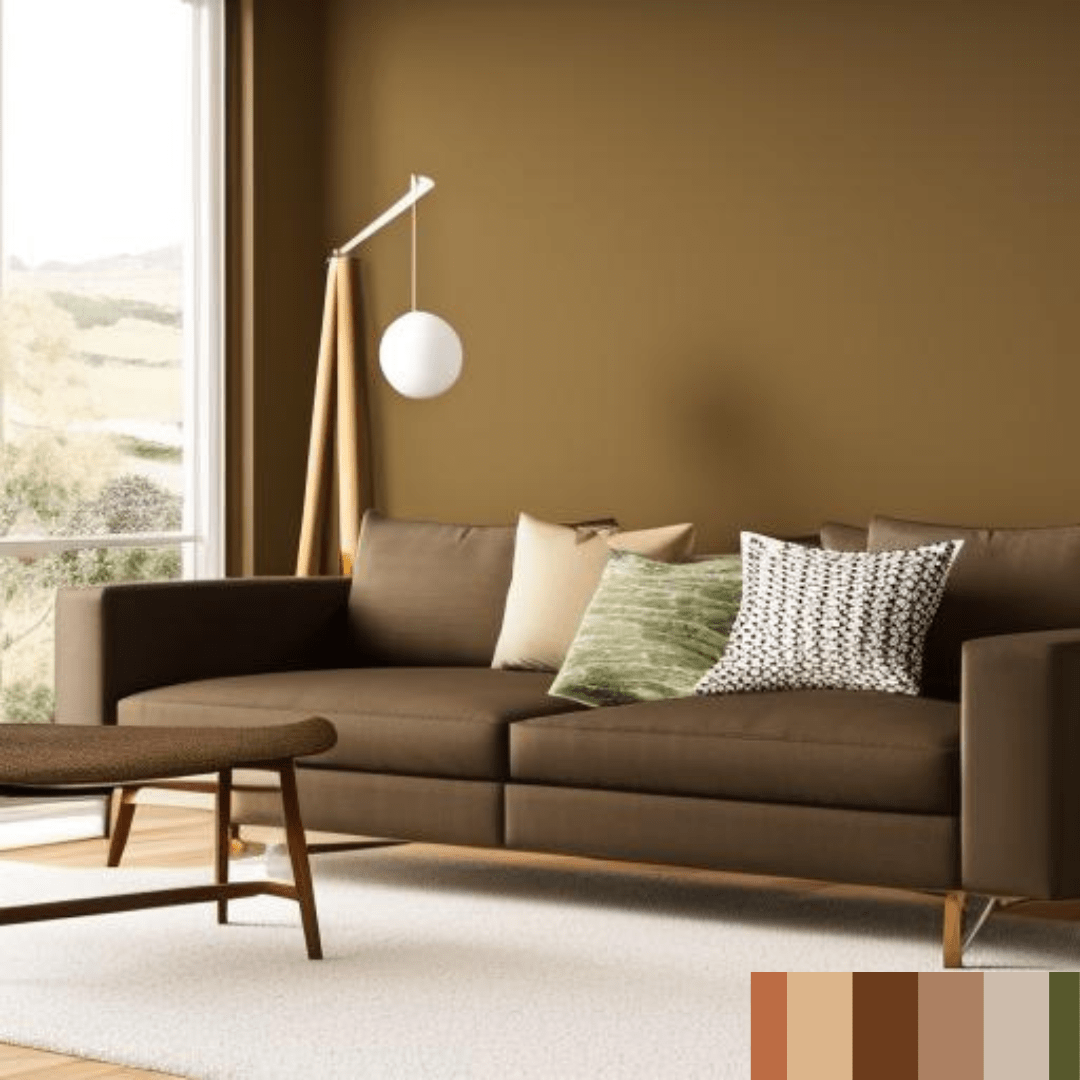
Warm tones
Warm tones are comprised of hues such as red, yellow, and orange. These hues are utilised to create a warm and welcoming environment. Warm tones can be utilised as an accent in a neutral-hued room or paired with other warm hues to create a warm and inviting environment.
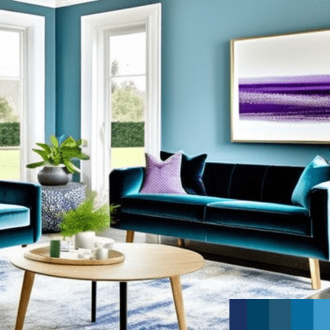
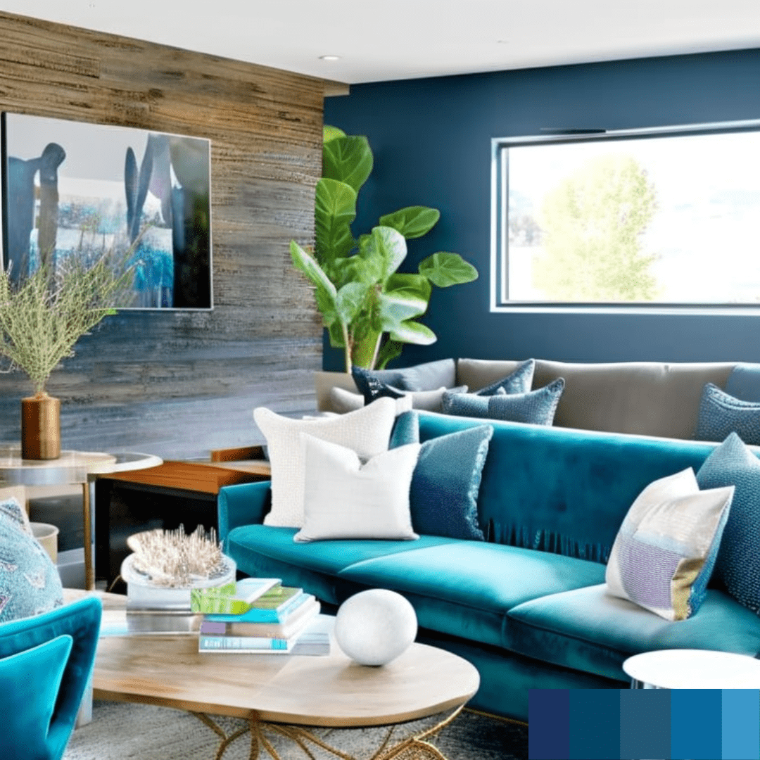
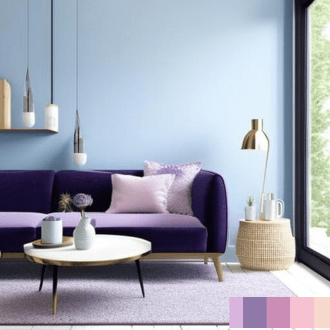
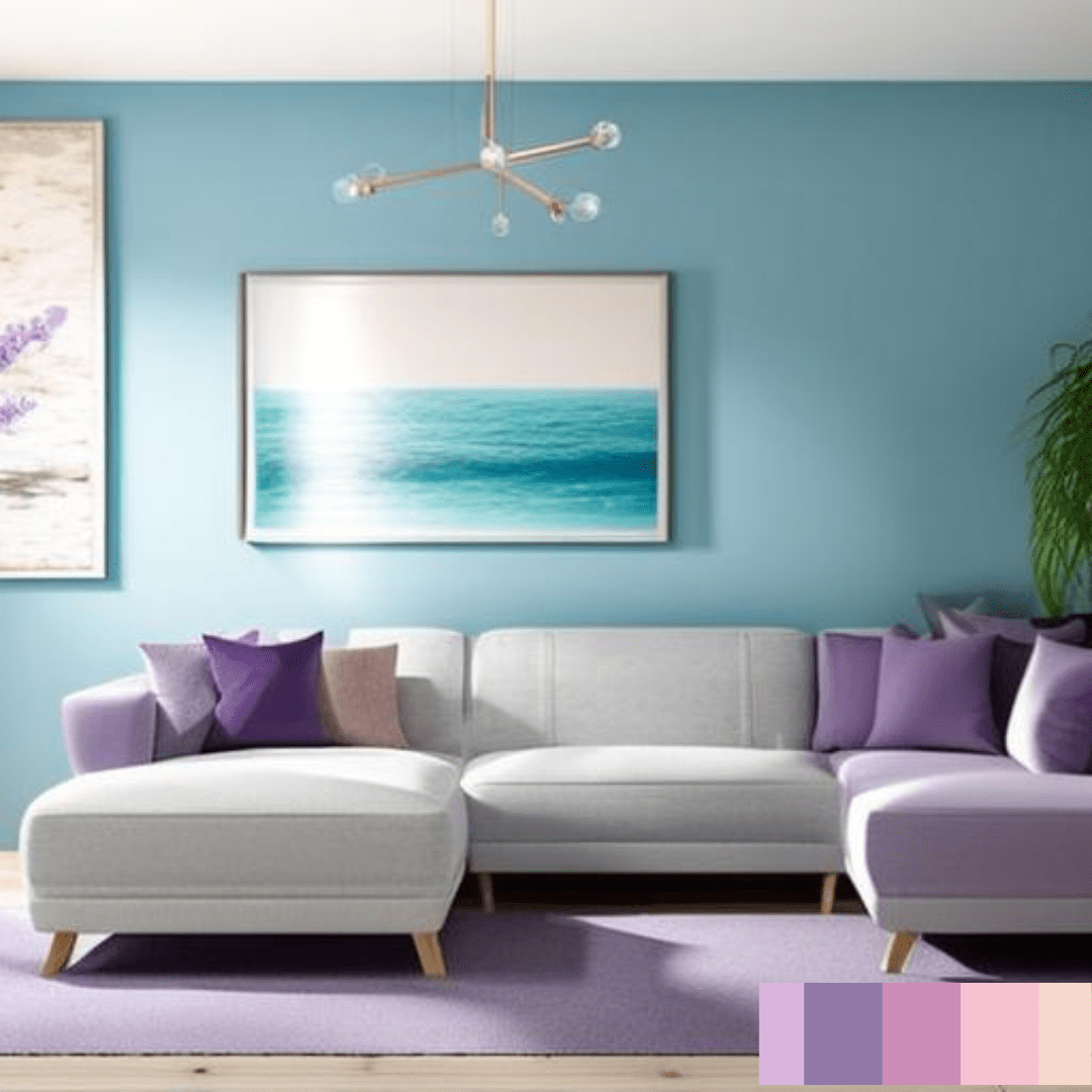
Cool tones
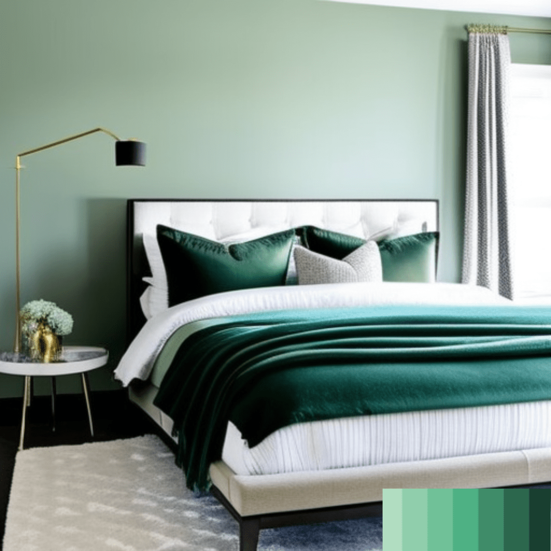
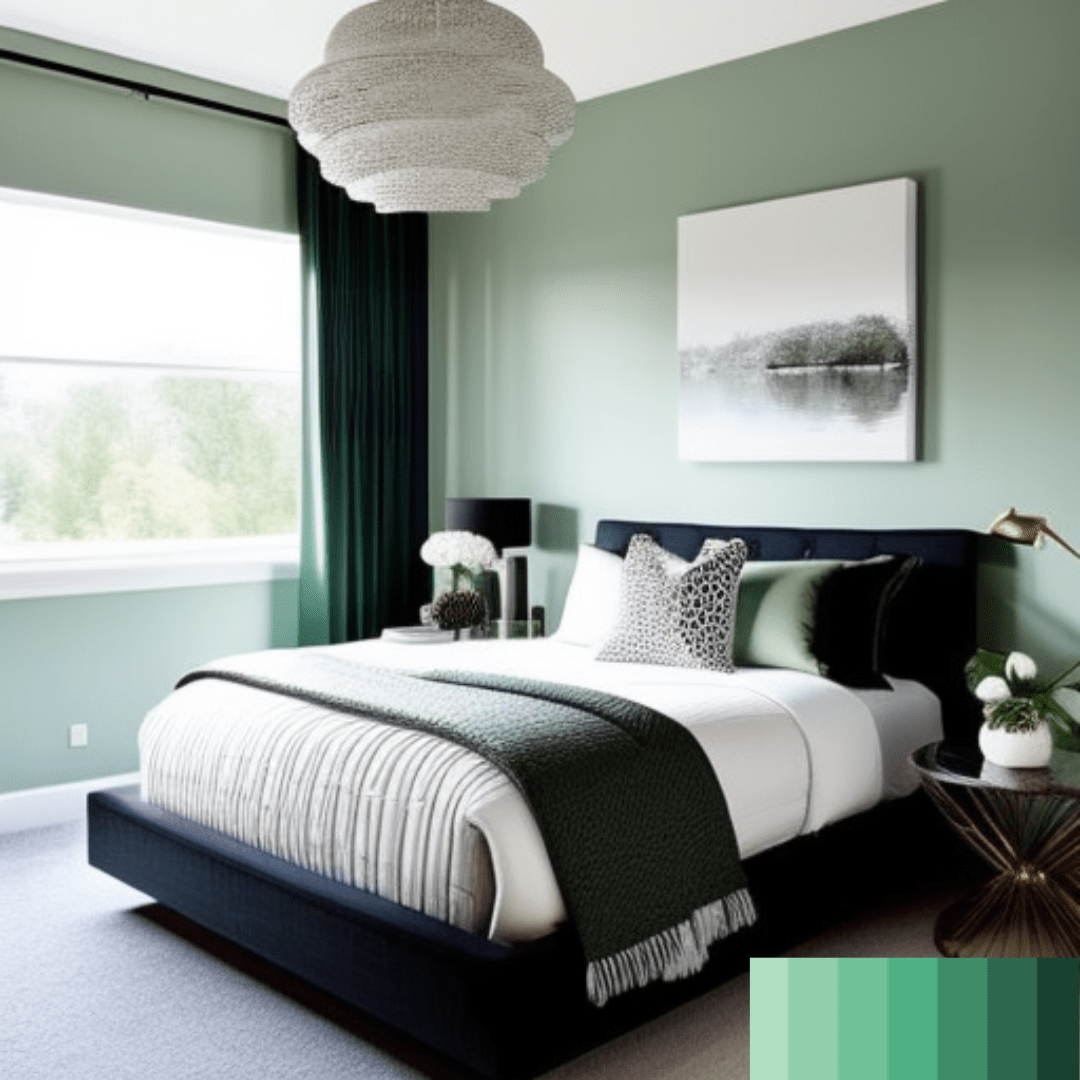
Colors such as blue, green, and purple are examples of cool tones. These hues are utilised to create a tranquil and peaceful environment. Cool tones can be utilised as an accent in a neutral-hued room or paired with other cool hues to create a calming and tranquil environment.
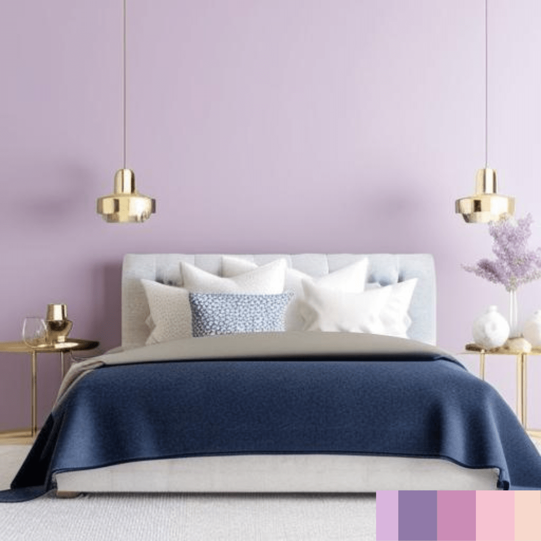
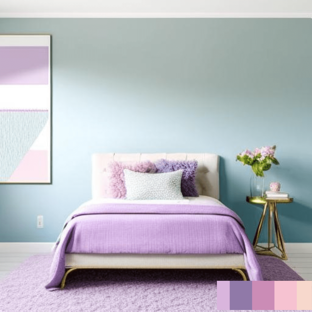
Pastel colours
Pastel colours are softer and more subdued variations of primary and secondary hues. These hues include pastel pink, baby blue, and light lavender. Particularly in bedrooms and nurseries, pastel hues are frequently employed to create a delicate and calming environment.
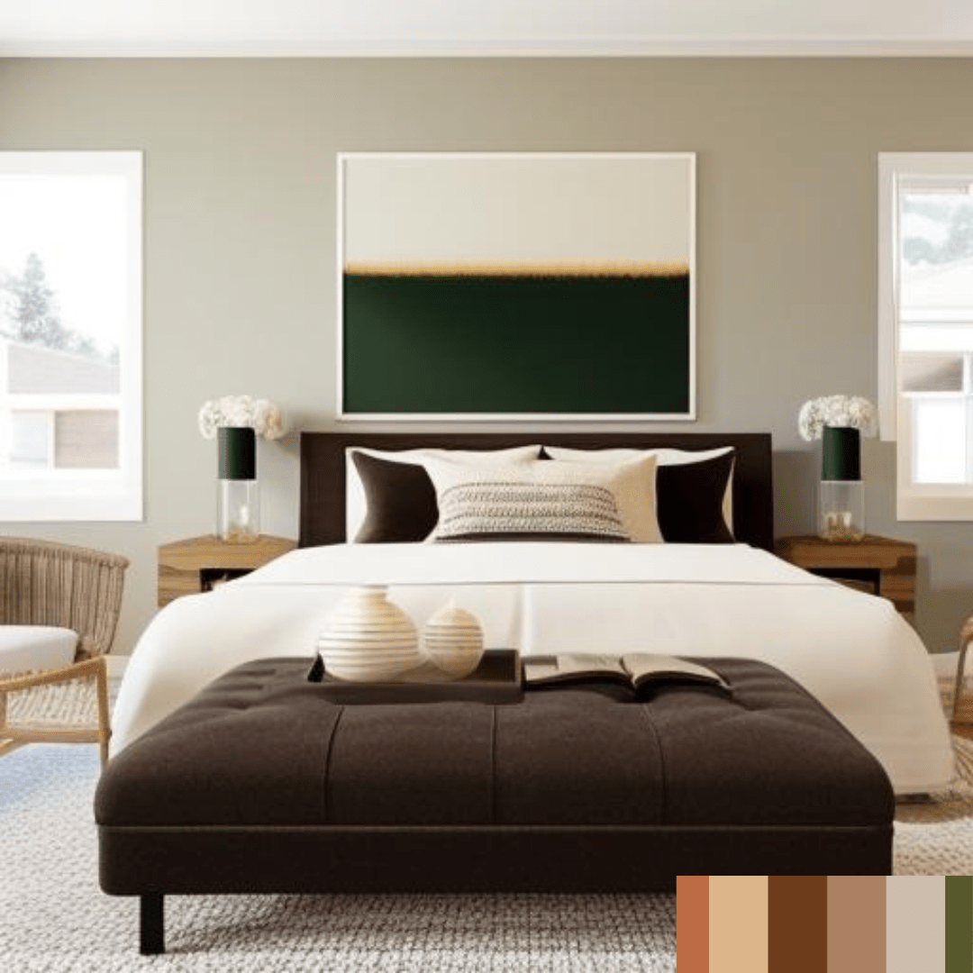
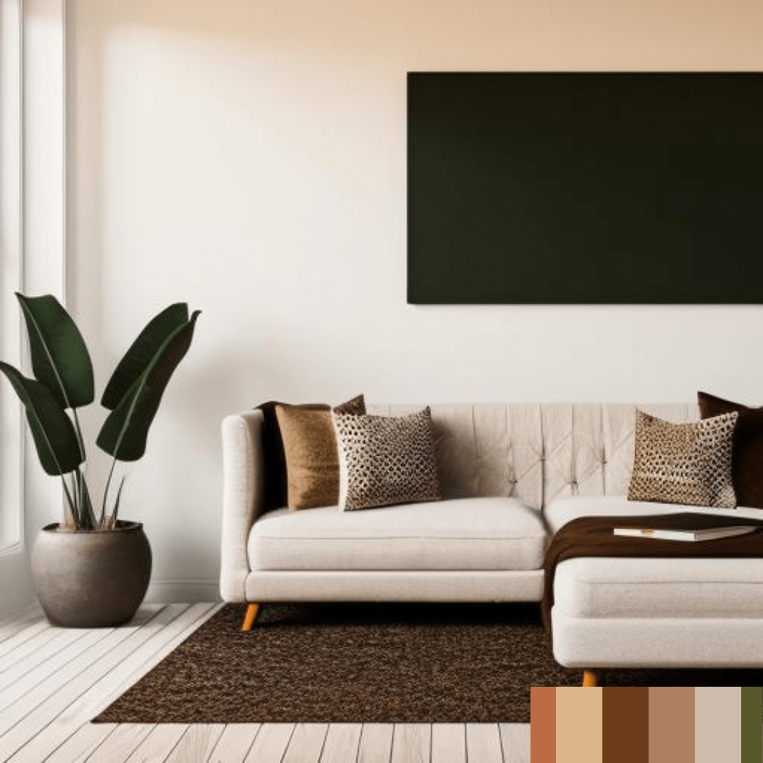
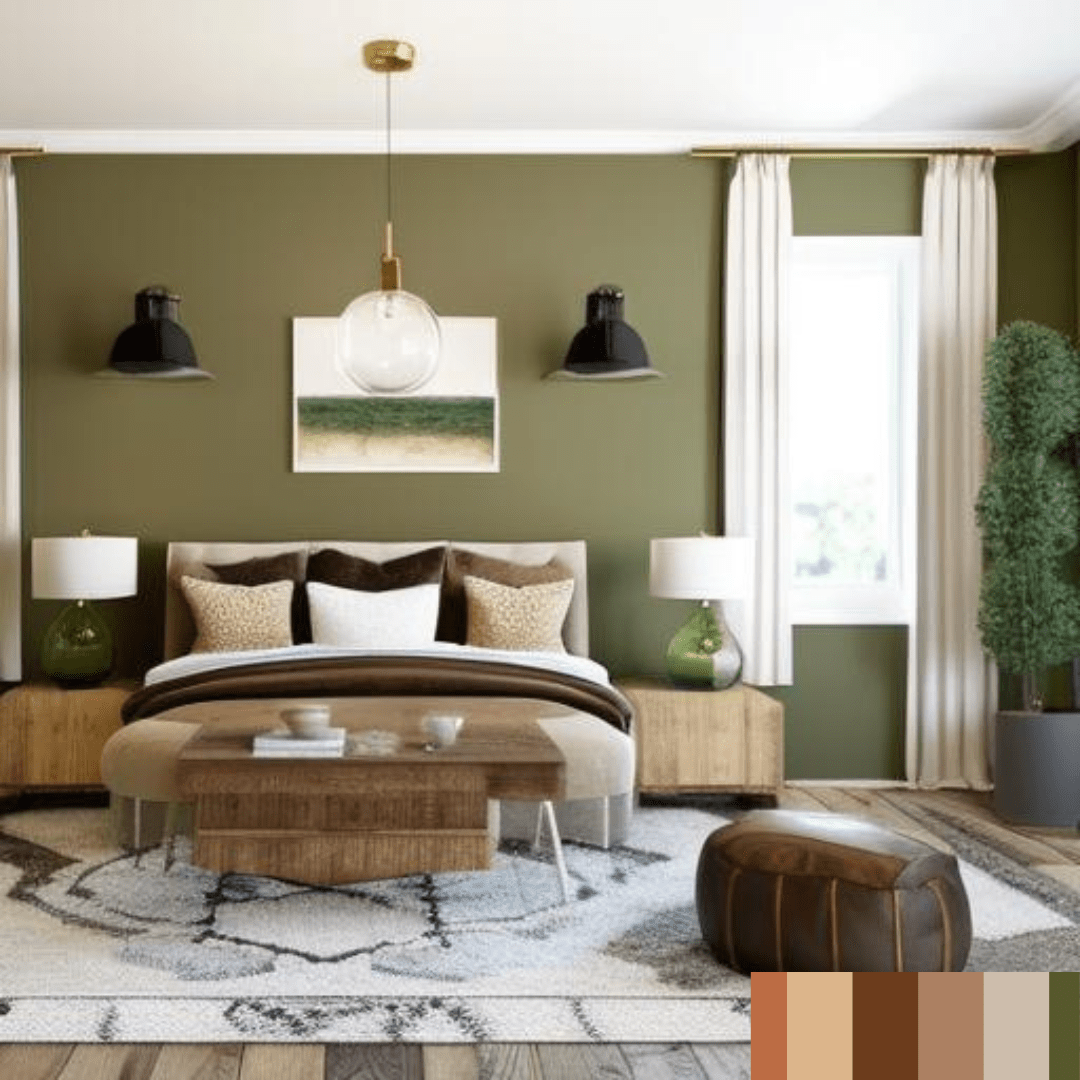
Earthy tones
Earthy tones consist of colours found in nature, including brown, green, and beige. These hues are commonly utilised in rustic or natural interior design styles to create a warm and welcoming ambiance. To achieve a balanced aesthetic, earth tones can be mixed with other earth tones or with brighter accent colours
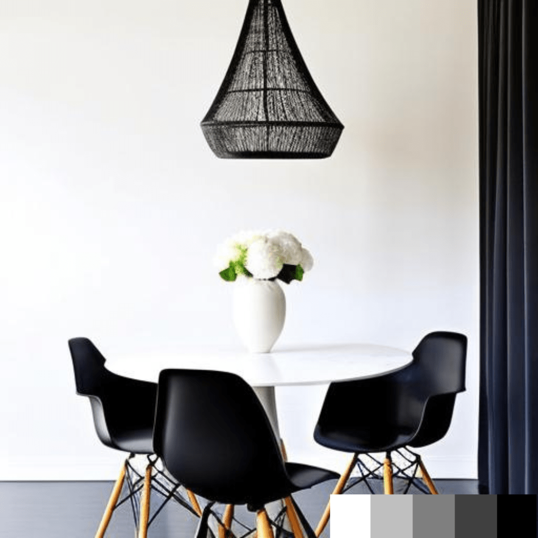
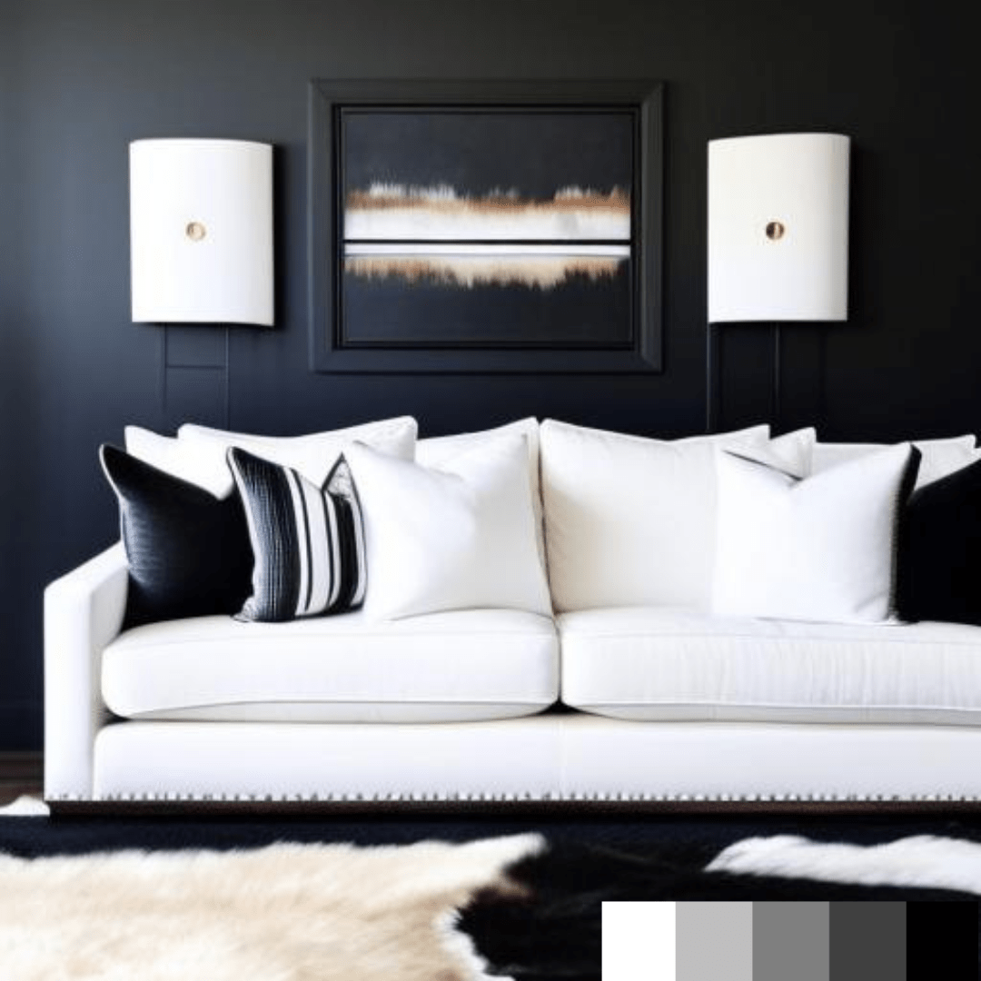
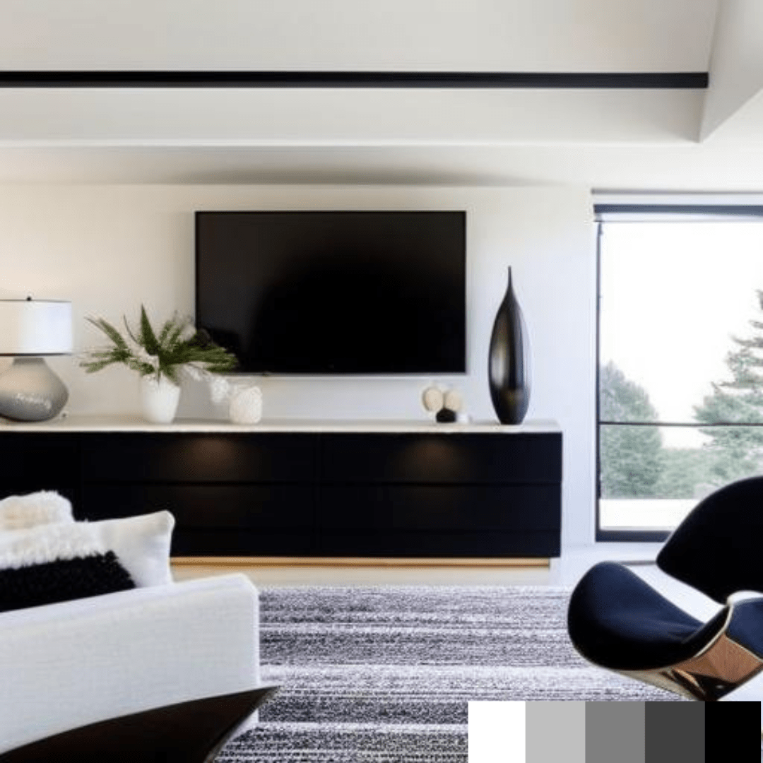
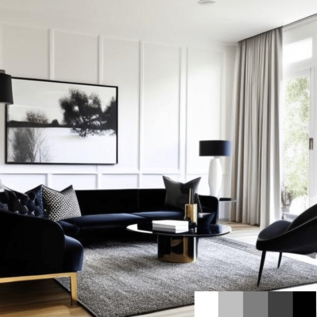
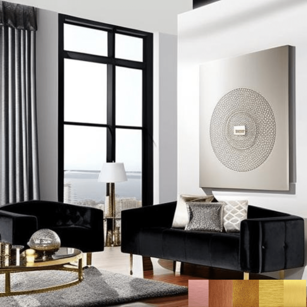
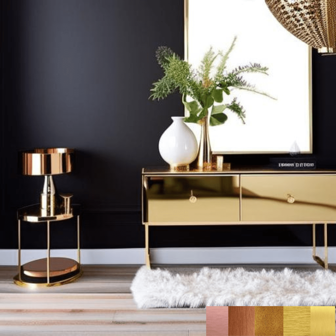
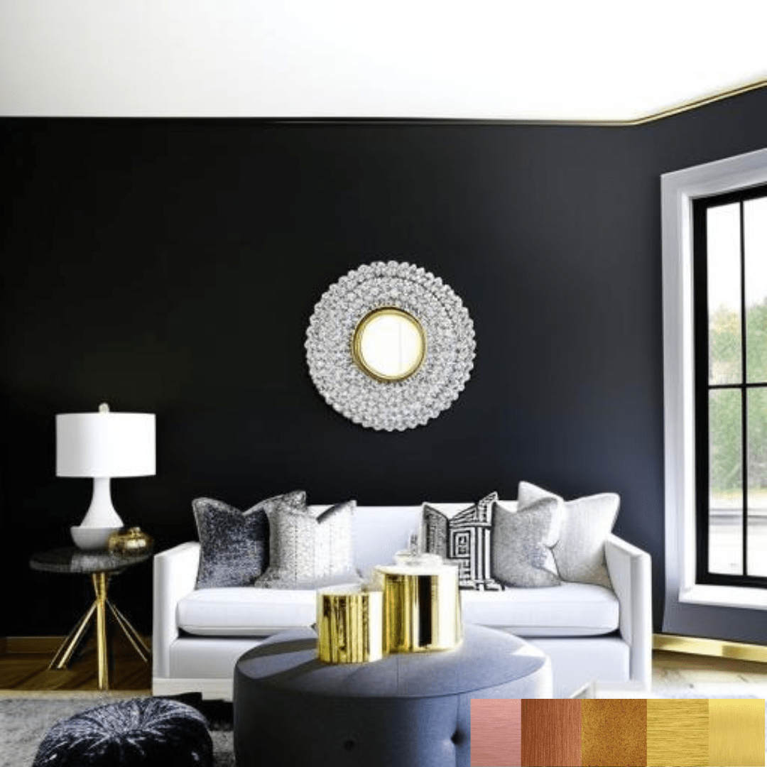
Black and White
Black and white are traditional hues that are frequently utilised in interior design to produce a sophisticated and timeless appearance. These colours produce a great contrast that can be used to create a graphic and contemporary environment or a more classic and formal appearance.
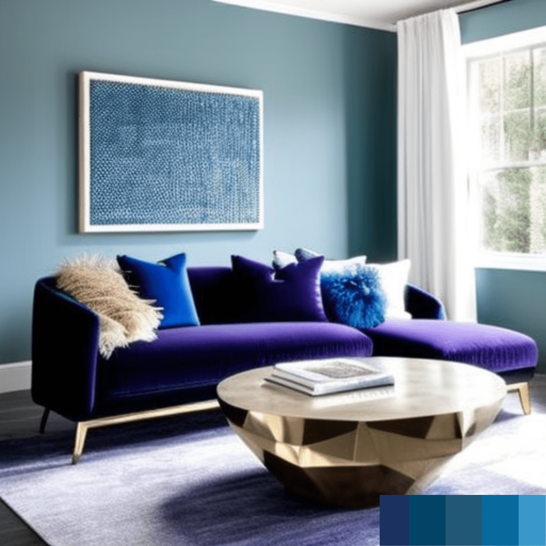
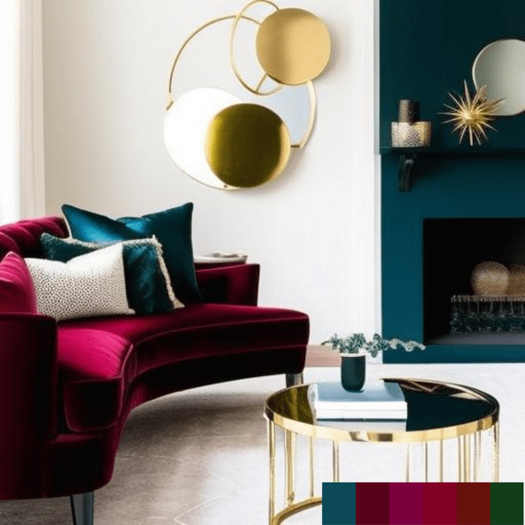
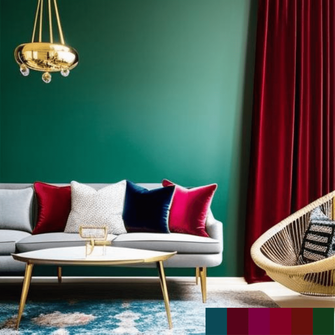
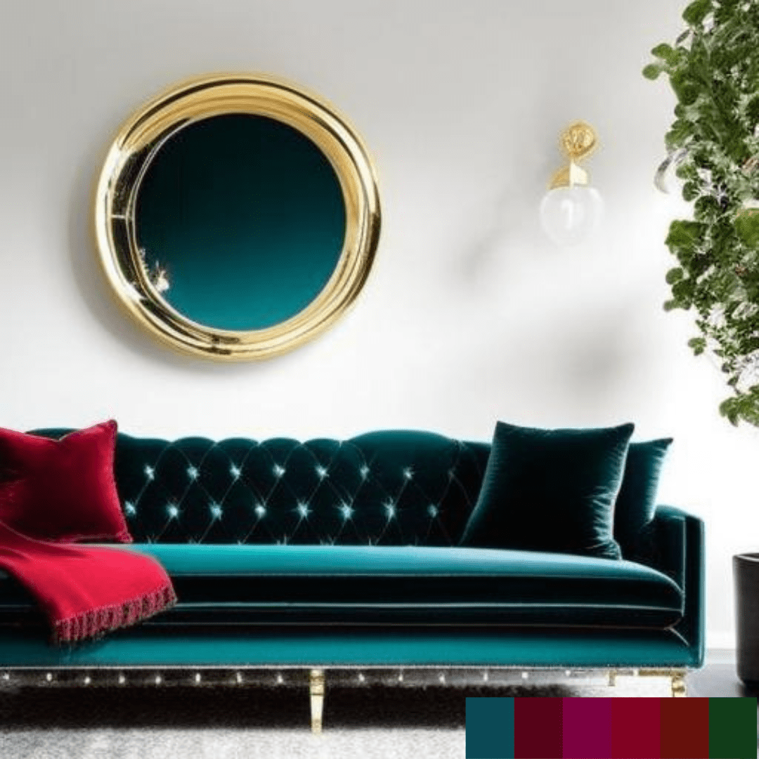
Jewel tones
Jewel tones are rich, saturated hues named after precious stones, such as emerald green, sapphire blue, and ruby red. These hues are utilised to create drama and opulence to a room. Jewel tones can be utilised as an accent in a space with a neutral colour scheme, or they can be paired with other jewel tones to create a luxurious environment.
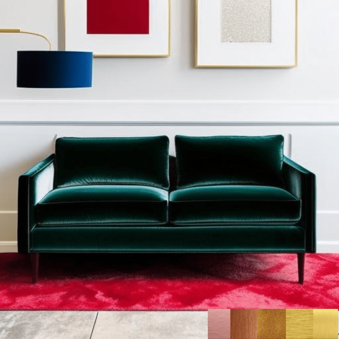
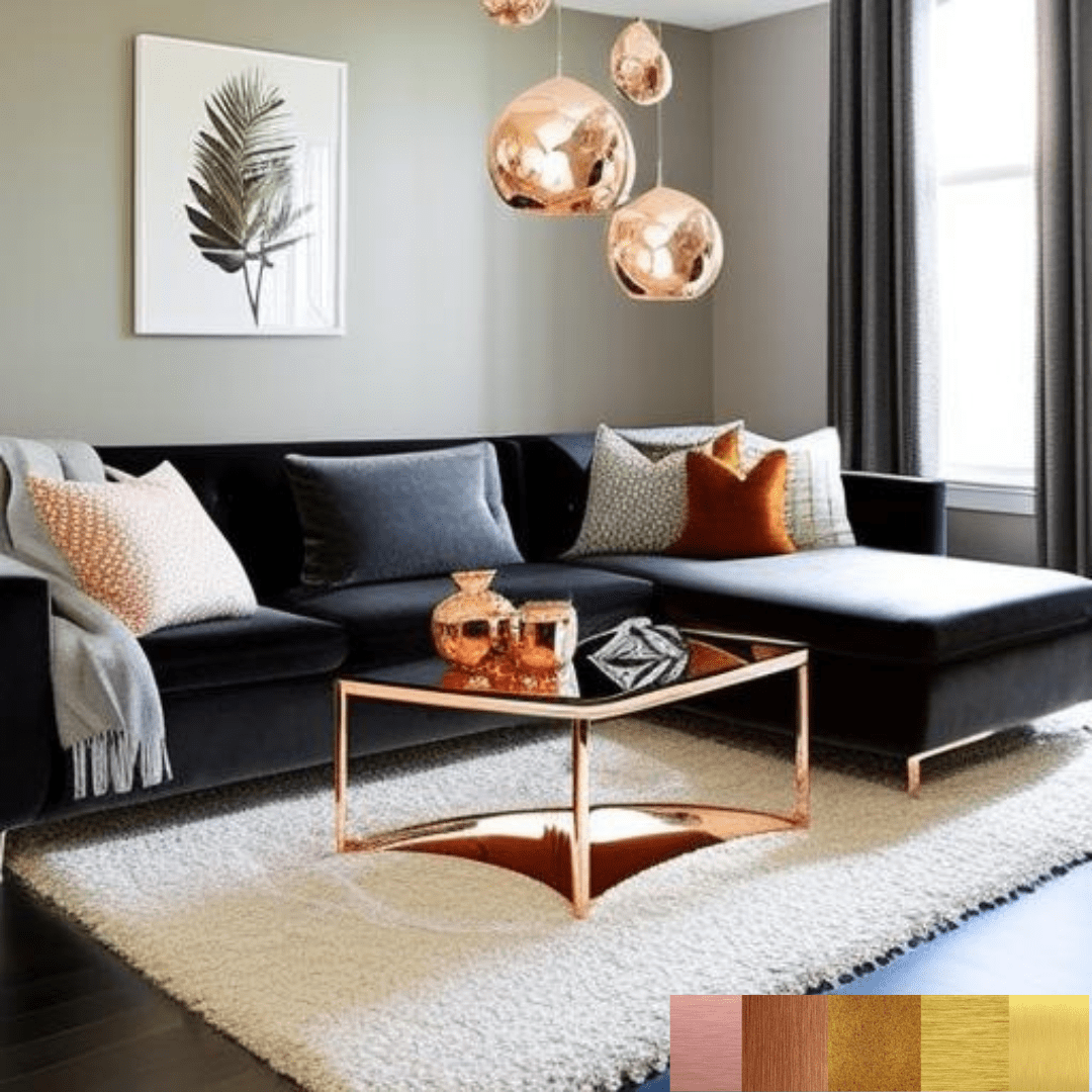
Metallic accents
Metallic accents are reflecting surfaces that lend a touch of glitz and sparkle to a place and are not colours. There are gold, silver, and copper embellishments. These elements may be utilised sparingly as room accents or as dominant features, such as metallic wallpaper or mirrored furniture.